Entry tags:
INFO PAGE: WAYSTAR
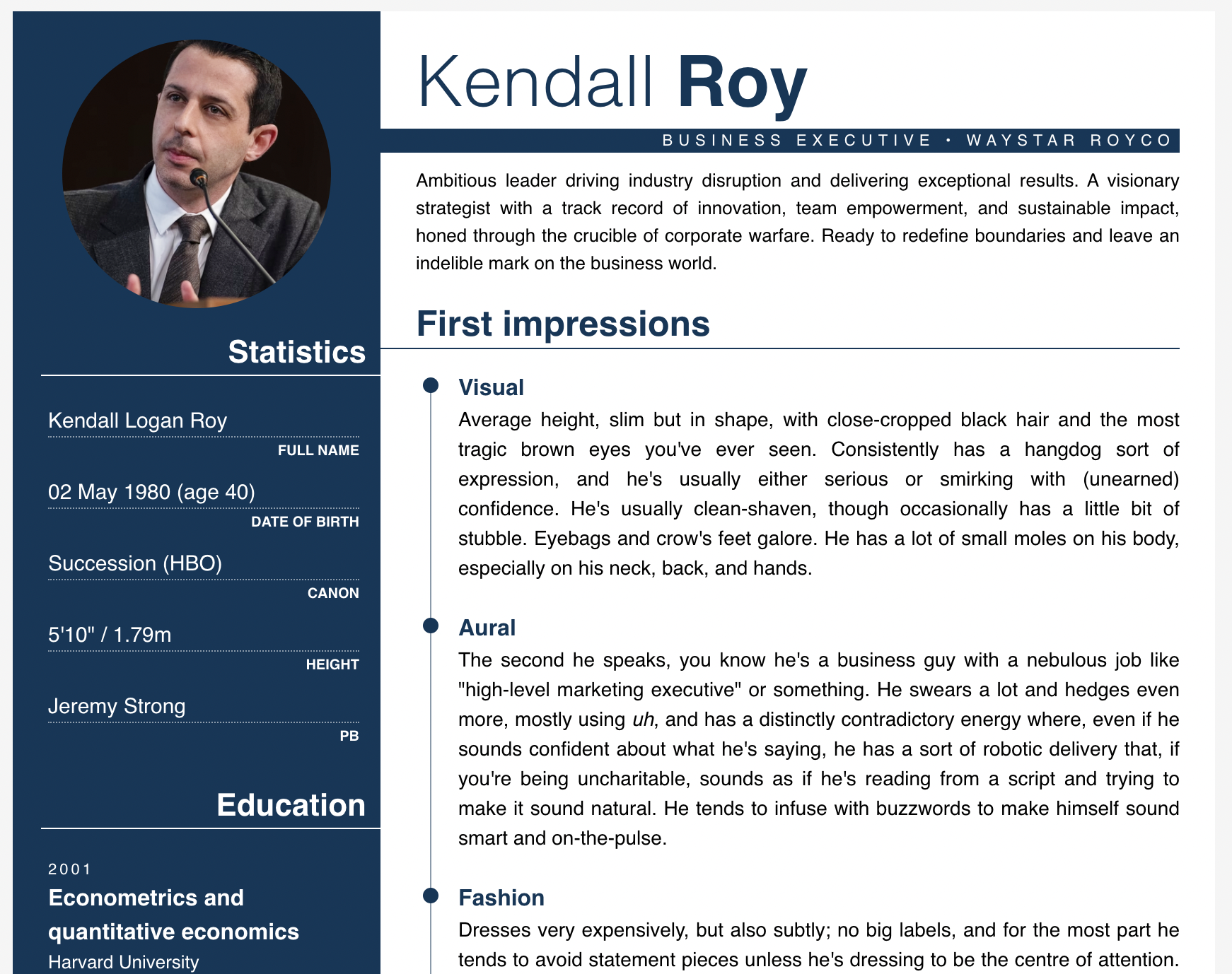
kind of dumb, but i found myself in need of a biosheet that was a bit like one of those boring corporate résumés. in honour of succession ending, i thought i'd pop the code up here! i figured this would also work pretty well as a biosheet if you take off the more résumé-specific stuff, and i ended up coding a bunch of extra panels/sections to make it more flexible.
the base code comes with the circular image and statistics block on the left, and then the blurb, first impressions and personality sections on the right. it will hopefully be really obvious where the extra panels go, and you'll be able to see them in action on this page.
hot tip, if you actually do want this to be like a résumé for your character: i used chatGPT to get that insanely robotic corporate-speak blurb at the top of the page. those things suck to write in real life, there's absolutely no reason you should have to write them while you're doing RP. i'm not usually an advocate of chatGPT but in this instance it seemed kind of like the only option lol
colours and fonts
not much in this, it's all super simple! so if you want to change things around, paste the code into a plaintext app and run a find and replace for the following things:
font: helvetica, sans-serif;
main text: #000
accent: #0a3759
background & left column text: #fff
the vertical line with the dots on it in the 'first impressions' section is the same as the accent colour, but reduced opacity (it looked too dark otherwise). this uses the 'rgba' format (
rgba(10, 55, 89, 0.5)
not much in this, it's all super simple! so if you want to change things around, paste the code into a plaintext app and run a find and replace for the following things:
font: helvetica, sans-serif;
main text: #000
accent: #0a3759
background & left column text: #fff
the vertical line with the dots on it in the 'first impressions' section is the same as the accent colour, but reduced opacity (it looked too dark otherwise). this uses the 'rgba' format (
rgba(0, 0, 0, 0)) instead of a hex code (#000000). to find the RGB equivalent of a hex code, you can use this website to pick a hex code and then plug the numbers it lists next to R, G, and B into the first three spots within the brackets. the fourth number is the opacity, with 0 being transparent and 1 being opaque, so pick a decimal. to change this colour, you're looking for this in the code:rgba(10, 55, 89, 0.5)
images
for the circular image, you can pick any image you want; it will scale to the right size to fit without stretching the circle.
for the 'contact' section, i used SVG icons from iconmonstr.
for the circular image, you can pick any image you want; it will scale to the right size to fit without stretching the circle.
for the 'contact' section, i used SVG icons from iconmonstr.
codes
base code
this is the only code you absolutely need, so make sure you get this one! as i said above, this one has the circular image, statistics, header, blurb, first impressions, and bio/personality sections. any other sections you want to add are below.
left column: "education" panel
paste anywhere after !----- NEW PANELS -----! as indicated, in whatever order you prefer. i just used this one to make mine look more like a résumé, but you can use whatever info you want – family, close CR, past games, whatever. if you want to add links here, i would suggest adding the following styling to make it more cohesive:
left column: "skills" panel
paste anywhere after !----- NEW PANELS -----! as indicated, in whatever order you prefer. again, you can do whatever you'd like with this one! the percentage bars can be customised however you'd like – look for
left column: "contact" panel
paste anywhere after !----- NEW PANELS -----! as indicated, in whatever order you prefer. tbh, this one is only here to make it read more like a résumé than just a regular biosheet – i'm not sure how useful this will be to anyone who's just looking for a biosheet, but i thought i'd pop it here just in case. the icons are SVGs from this website and if you know what you're doing with code, you can definitely find different icons on the website and replace the svg elements in this code with whatever pics you'd like! a note that you'll have to add
right column: in depth "skills" panel
paste after !----- END LONGFORM INFO -----!. this one is another pretty simple section, mostly for if you want to list a character's skills but you need more space than the version up there for the left column. you can add as many skills as you want to this (copy from !-- SKILL --! to !-- END SKILL --!). there's also options for if you want to add bullet points or just have a paragraph. i coded my own bullet points because the dreamwidth list coding is different between the preview page and the actual journal entry (for some damn reason), but it should hopefully be easy to understand how to add more bullet points. let me know if you need any help with this one!
right column: links
Link example here
this one is just to make sure your links look cohesive with the rest of the code on this half of the page!
OKAY, i hope that's everything. if you have any questions, please leave a comment here!
base code
this is the only code you absolutely need, so make sure you get this one! as i said above, this one has the circular image, statistics, header, blurb, first impressions, and bio/personality sections. any other sections you want to add are below.
left column: "education" panel
Education
2001
Econometrics and quantitative economics
Harvard University
2008
Master of Business Administration (MBA)
Columbia University
paste anywhere after !----- NEW PANELS -----! as indicated, in whatever order you prefer. i just used this one to make mine look more like a résumé, but you can use whatever info you want – family, close CR, past games, whatever. if you want to add links here, i would suggest adding the following styling to make it more cohesive:
style="color: #fff; text-decoration: none;"left column: "skills" panel
Skills
STRATEGIC LEADERSHIP
BUSINESS DEVELOPMENT
FINANCIAL ACUMEN
ADAPTABILITY AND RESILIENCE
paste anywhere after !----- NEW PANELS -----! as indicated, in whatever order you prefer. again, you can do whatever you'd like with this one! the percentage bars can be customised however you'd like – look for
width: 50% and change the number to whatever percentage you want.left column: "contact" panel
Contact
481-516-2342
candybaby@waystar.com
Bikini Bottom
@RealKendallRoy
paste anywhere after !----- NEW PANELS -----! as indicated, in whatever order you prefer. tbh, this one is only here to make it read more like a résumé than just a regular biosheet – i'm not sure how useful this will be to anyone who's just looking for a biosheet, but i thought i'd pop it here just in case. the icons are SVGs from this website and if you know what you're doing with code, you can definitely find different icons on the website and replace the svg elements in this code with whatever pics you'd like! a note that you'll have to add
fill=#fff to the 'path' element within the svg code, and you might have to fiddle with the height/width to make it look nice. if you really want to use the icons but you're not confident about editing this, leave a comment and i'll help you out! again, if you want to add links here, i would suggest adding the following styling to make it more cohesive: style="color: #fff; text-decoration: none;"right column: in depth "skills" panel
Skills
Strategic leadership
•Demonstrated ability to lead teams, make critical business decisions, and drive organizational success through visionary leadership and strategic thinking.
Business development
•Proven track record of identifying and capitalizing on market opportunities, forging strategic partnerships, and driving business growth.
•Led the successful acquisition and integration of multiple companies, expanding the company's market presence and diversifying its revenue streams.
•Implemented innovative business models, leveraging technology and data analytics to drive operational efficiency and deliver exceptional financial results.
Adaptability and resilience
Demonstrated ability to lead teams, make critical business decisions, and drive organizational success through visionary leadership and strategic thinking.
paste after !----- END LONGFORM INFO -----!. this one is another pretty simple section, mostly for if you want to list a character's skills but you need more space than the version up there for the left column. you can add as many skills as you want to this (copy from !-- SKILL --! to !-- END SKILL --!). there's also options for if you want to add bullet points or just have a paragraph. i coded my own bullet points because the dreamwidth list coding is different between the preview page and the actual journal entry (for some damn reason), but it should hopefully be easy to understand how to add more bullet points. let me know if you need any help with this one!
right column: links
Link example here
this one is just to make sure your links look cohesive with the rest of the code on this half of the page!
OKAY, i hope that's everything. if you have any questions, please leave a comment here!
no subject